NezHost
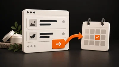
Someone may read your salon's offer and leave because they are still comparing options, do not know which service to choose or are planning a visit later. Reading alone does not prove the website is faulty. But if you repeatedly hear “I couldn't find how to book”, you have a specific point to investigate.
Start with one important page. Follow the journey from the offer through the button to what happens after it is used. At each step, note the decision someone must make and whether they have the information they need.
Is the choice clear before the button?
A heading and photograph may create a pleasant impression, but clients need more practical information before booking. Which service is this page about? What options does it have? Where is the salon? Is the price stated, or will you confirm it after discussing their needs?
If people often do not understand the difference between similar options, do not immediately ask them to choose a specific appointment. Offer a way to ask first. At a clinic, the next step may be requesting a consultation, according to its actual process. The website should not replace professional assessment.
Place useful information near the decision point. A price list link at the other end of the website is less helpful than a brief explanation of options beside the service.
The button wording should match its destination
“Book” might mean choosing an appointment, sending a non-binding enquiry or opening an email. For a visitor, these are different actions. Name the actual one.
- Choose an appointment: the visitor moves to a booking calendar.
- Call the salon: the phone opens the option to make a call.
- Send an enquiry: the person sends a message and waits for a reply.
- Arrange a consultation: they continue through the business's described process.
If the link opens another service, briefly explain that. Skin Care Studio Tábor links to the external MyFox service. In that situation, the website should prepare visitors for the move, without implying that clicking alone creates a booking.
You can repeat the same main action after the service explanation or at the bottom of the page. There is no need to alternate between a phone call, newsletter, Instagram and form when someone is trying to arrange a single appointment.
A hypothetical example of one improvement
Imagine a salon whose service page ends with a button labelled “More”. Clicking opens general contact details, and the visitor has to explain again what they want. It is unclear whether they are asking a question or booking an appointment.
A more specific version might say: “Unsure which treatment to choose? Tell us which service you are considering, and we will discuss the next step.” The button could read “Ask about a treatment”, and the form could retain the service name.
This is a hypothetical solution, not a documented client result. Its suitability depends on whether the salon actually handles messages and offers this way of arranging a visit.
The form should ask for what you need to reply
For an initial enquiry, you generally need a contact method and a brief explanation of what the person is asking about. For every additional required field, consider how it helps. Do not request a full address or lengthy questionnaire simply because the template includes them.
A general enquiry form should not encourage visitors to send sensitive health details. If professional consultation forms part of a clinic's process, the clinic must define how this information is shared.
After submission, visitors should know whether the message was received and what follows. Promise a response time only if it matches actual capacity. Then find the test message on the salon's side too; an on-screen confirmation alone does not prove delivery to a channel someone monitors.
Follow the whole journey on a phone
Open the page as a new visitor, choose a service and use the main button. Check readability, any elements covering the button, the form and returning from external booking. In particular, check that people can call or write if the calendar does not offer a suitable option.
To distinguish traffic from real contacts in more detail, use our salon website measurement guide. Here, the goal is to identify and verify one specific step on the page.
Send us the page address and a description of what should happen after clicking through NezHost contact. We can review how the copy, button and form connect, and suggest a change that fits your salon's actual booking method.
See how we build websites for beauty salons and aesthetic clinics.